Context
The year is 2021, Glovo is catching up with it's competitors in terms of offering tools for partners to help in improving their businesses.
Problem
Our Partners had little data about their store performance and almost no self-service tools, which negatively impacts the quality of content in Glovo's app.
Solution
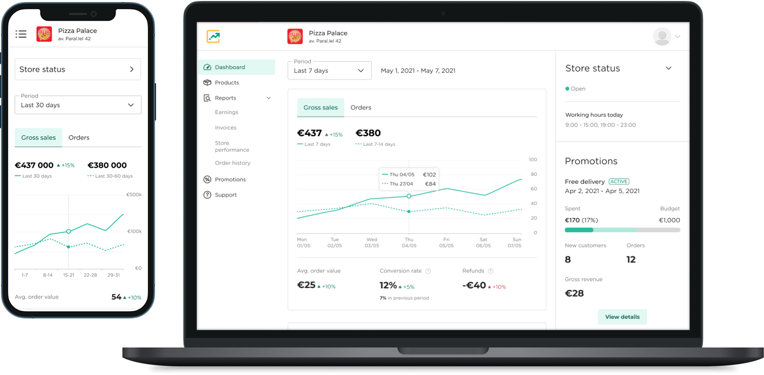
We decided to craft the Manager Portal to give partners the tools they need to oversee and manage their stores, with a dashboard as the homepage (this project's focus).
Business objectives

Decrease product issues (missing/wrong items)

Increase Manager Portal active users

Support scaling to 120k+ active partners
Timeline (2021)
Desk research
Ideation
Lo-fi iteration 1
Ideation workshop
Hi-fi Iteration 2
Hi-fi iteration 3
+ multi-store
Hi-fi iteration 4
Review pull-requests
Measure & iterate
My activities
- Design estimations / timeline alignment
- Delegating areas of the Manager Portal to different designers
Discovery research
A round of quantitative research was already done and yielded information that we used to build the sitemap. The next round was a qualitative study - In-depth interviews & closed card sorting with 10 partners in Spain, across different segments.
Main questions to be answered
- What's the most important information partners would like to see at a glance about their store?
- Which features for a management portal are the most important for our partners?
- Does our sitemap match users' mental model?
My activities
- Co-created the script with the UX researcher
- Attend interviews and note-taking
- Supported synthesizing the results into a report
Findings

Top priority
Order tracking, earnings, and customer reviews are what managers rely on most day-to-day.

Most wanted features
Menu management and a way to interact with customers post-order (rewards, replies, disputes). Multi-store managers want one account to manage everything.

Reporting needs
Top-selling products, promo ROI, and new vs. repeat customers.

Sitemap validation
Mostly validated, but "Team management", "Invoices", "Operations", and "Edit availability" weren't intuitively understood and need clearer labeling.
First iteration - Lofi
With the discovery UXR findings at hand, I proceeded to ideate and craft the 1st lo-fi version of the dashboard:
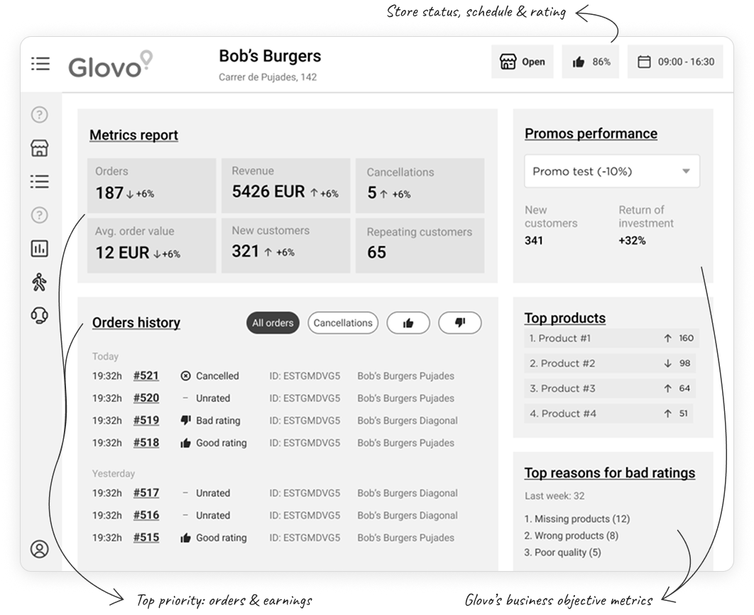
Validation
In order to make sure the design covered user needs, I ran a quantitative unmoderated user test with 50 partners, using the Maze testing platform.
 Validation results
Info matches expectations
Dashboard content aligns with what managers expected. Most are satisfied overall and across individual sections.
Info is relevant
Most managers find the displayed information useful or very useful, both overall and section by section.
Gaps remain
Managers still want rider info, plus the ability to delay/reject orders and open cancellation disputes with customers.
My activities
- Design and prototype
- Plan, set-up and synthesis of the Maze test
Second iteration - Hifi
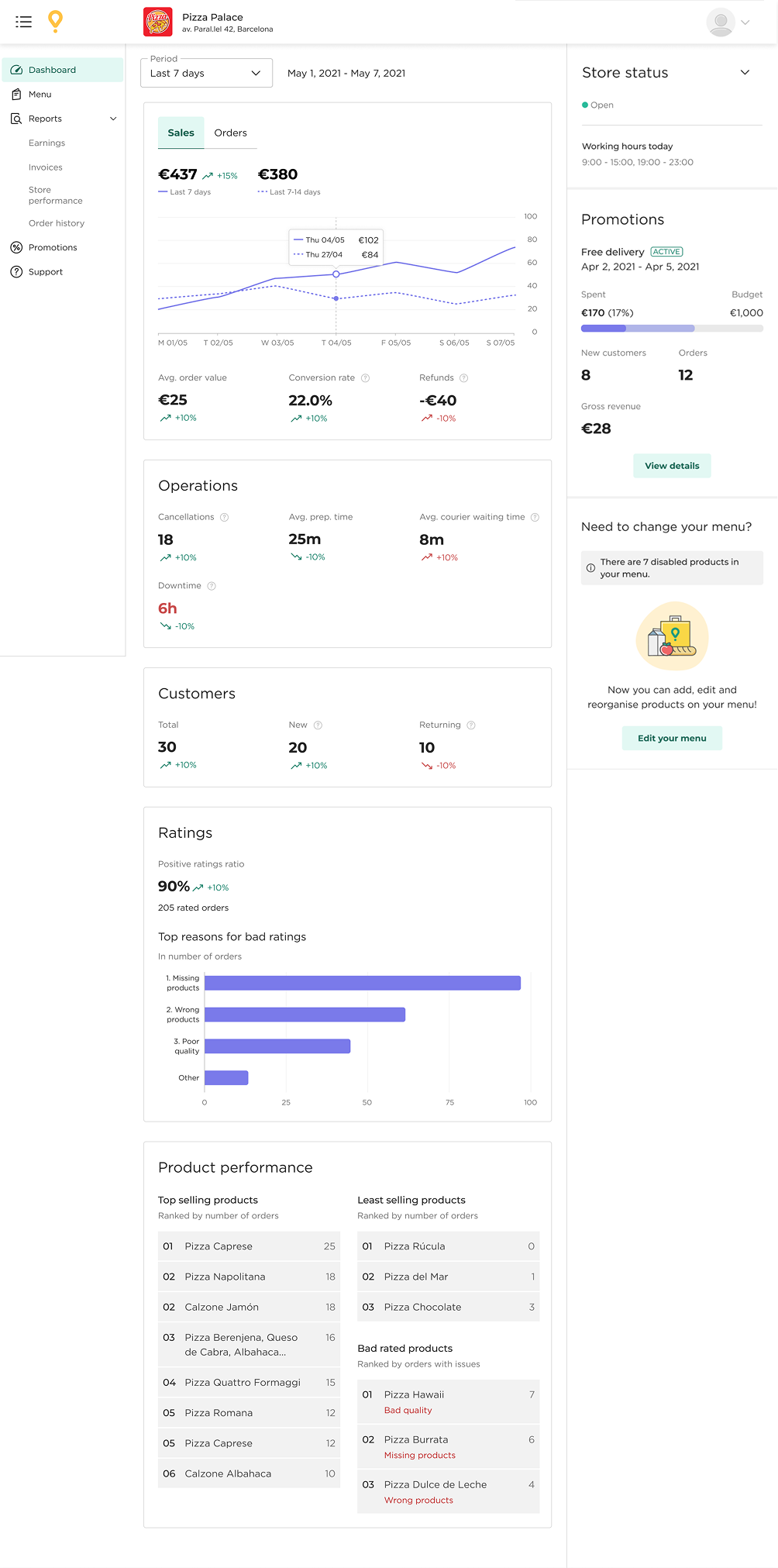
After taking additional design decisions informed by the test and stakeholder input, I proceeded to craft the 2nd iteration in high-fidelity.
Design decisions based on findings
- Clustered and added metrics
- Added tooltips and graphs
- Rearranged modules
- Removed "Orders history" as it was already prominent in the Orders app
Usability testing & third iteration
A round of quantitative research was already done and yielded information that we used to build a sitemap. The next round was a qualitative study where we dived deeper in user needs and also validated our sitemap.
Main question to be answered
Does the dashboard includes the most relevant info for partners and presents it in the way they expect to find it?
Method
- 101 Usability testing
- 5 single-store partners in Spain
My activities
- Co-created the script with the UX researcher
- Attend tests and note-taking
- Supported synthesizing the results into a report
Some of the findings and how they impacted the designs:
Top-level metrics
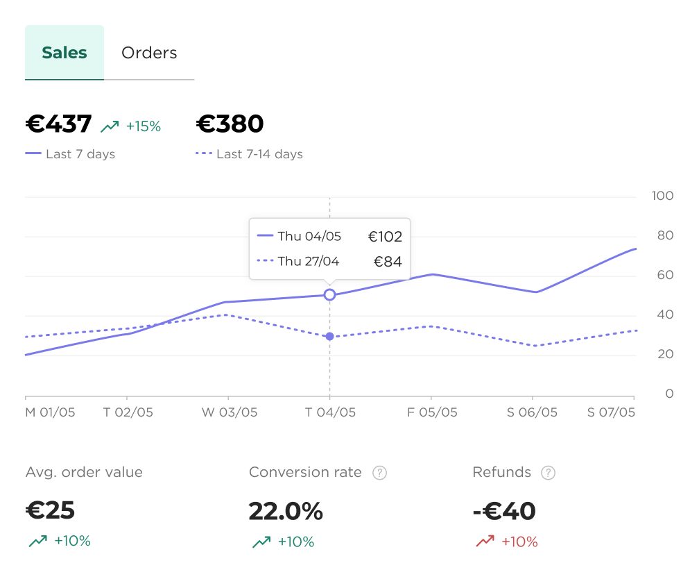
- Sales: Unclear if Glovo's commission is already subtracted from the earnings.
- Conversion rate: Unclear which is the data from the previous period (is it 12% or 20%?).
- Fluctuations: The relation between the arrow and color was well understood.
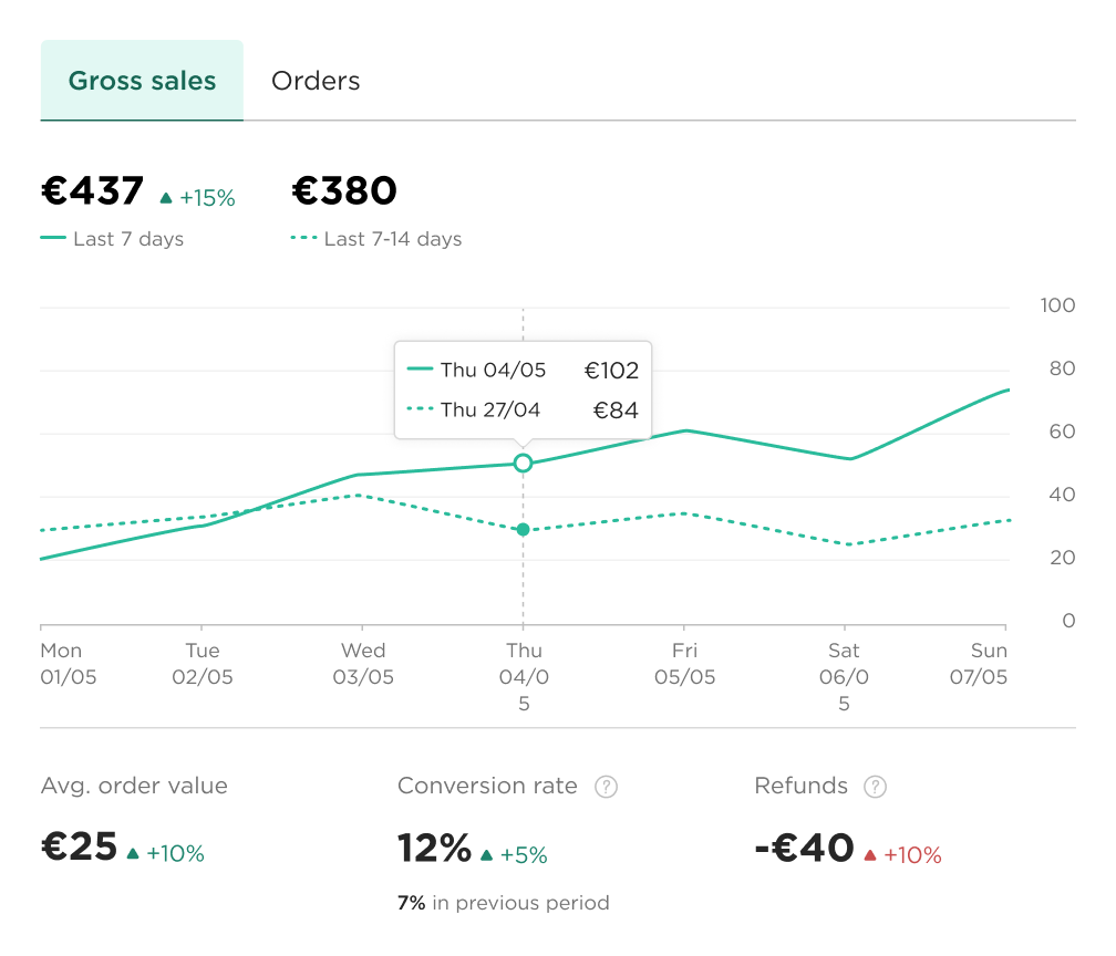
- Sales: Switched the copy to "Gross sales".
- Conversion rate: Included the value from the previous period.
- Graph colours: Switched to the primary colour as Purple could conflict with another brand: Grovo Prime.
Ratings
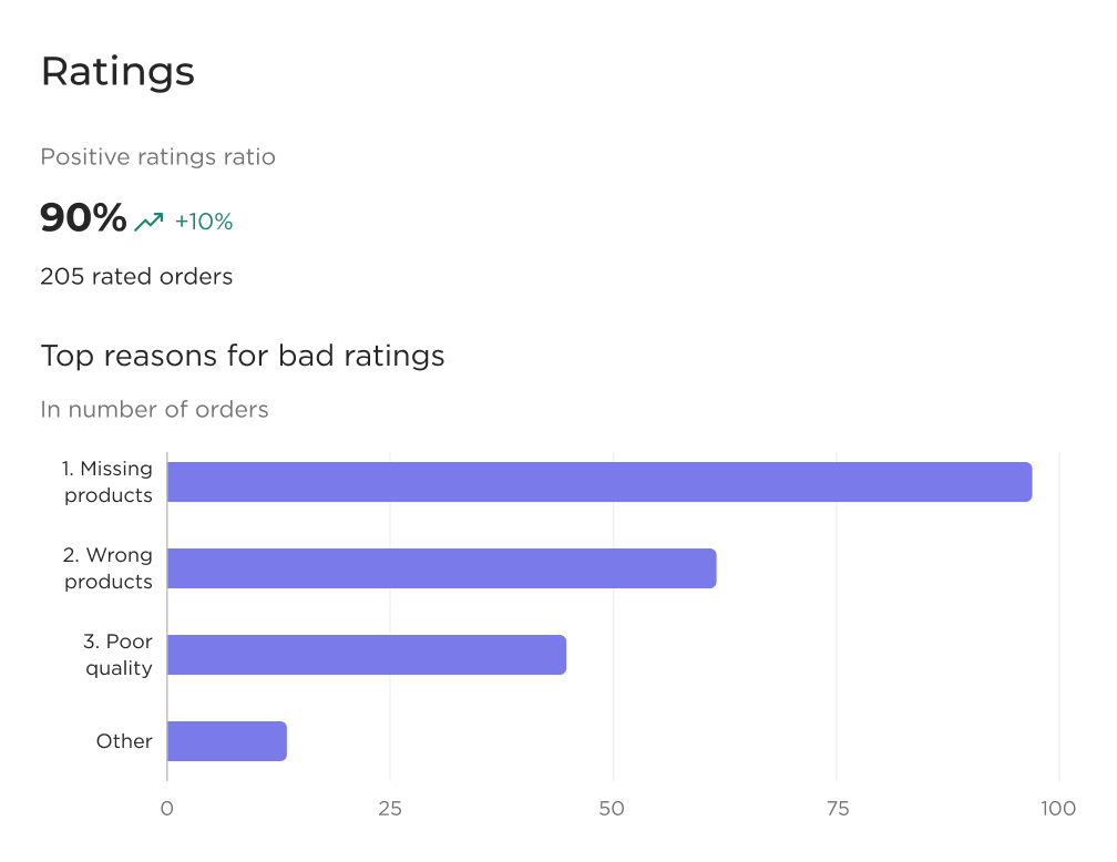
- Ratings ratio: Was mostly ignored by participants as the graph below captured all the attention.
- Bar graph: Users perceived the x-axis as percentages, though it was labeled as "number of orders".
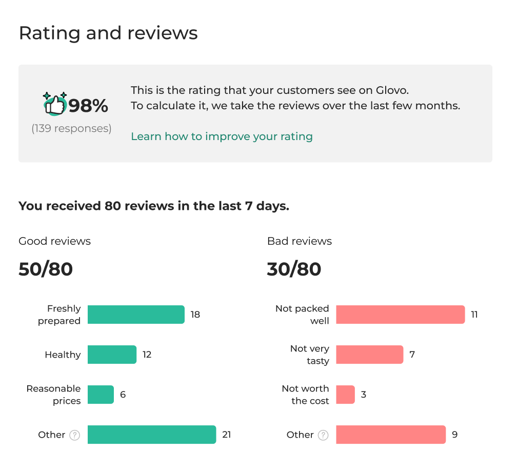
- Ratings ratio: Changed the element for it to draw more attention and match the Customer App.
- Bar graph: Expanded the information, reworking the information hierarchy and spacings.
Product insights
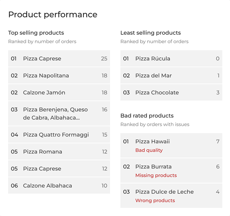
- Data visualization: Users expressed their need for more visual representations.
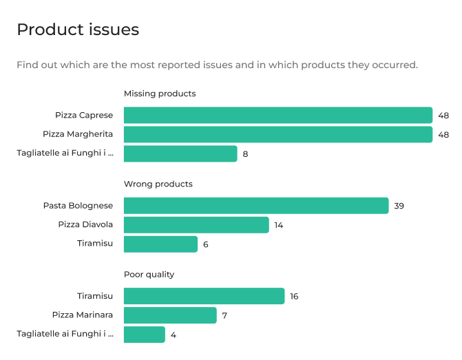
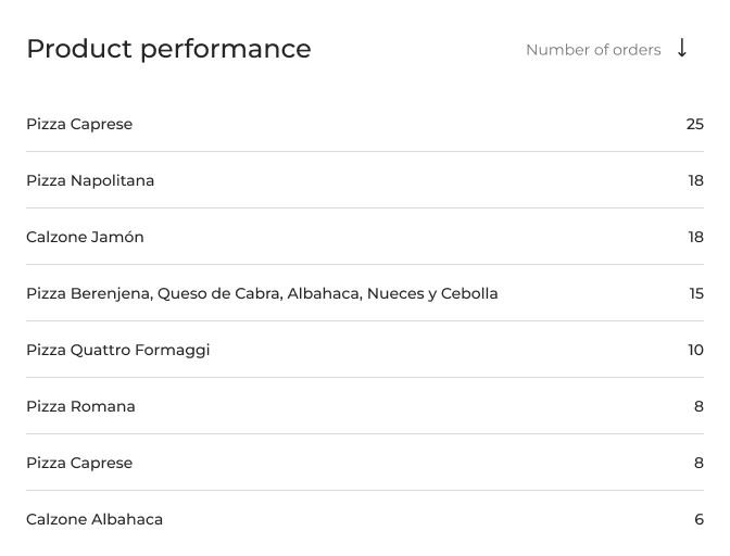
- Data visualization: Horizontal bar graphs make issue volume easy to compare.
- Categorization: Its own widget separates issue type from sales performance.
- Kept as-is: The product ranking tested well, so we expanded the list.
Responsive design
Mobile layout, validated in the same round:

Impact
Partners were now able to spot which of their products were often missing or incorrect, being able to take action and improve.